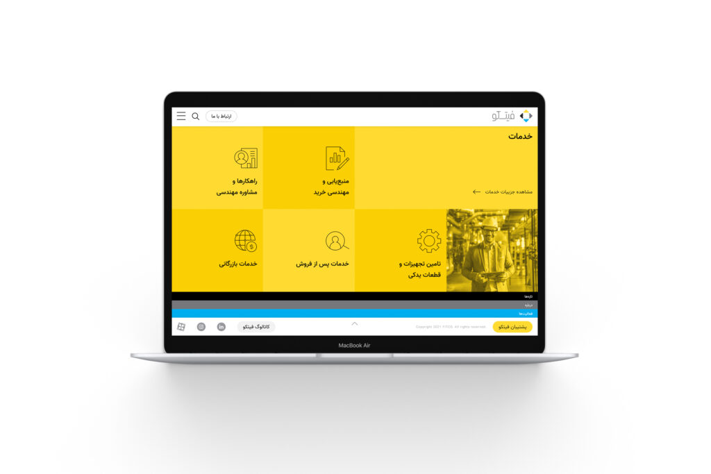
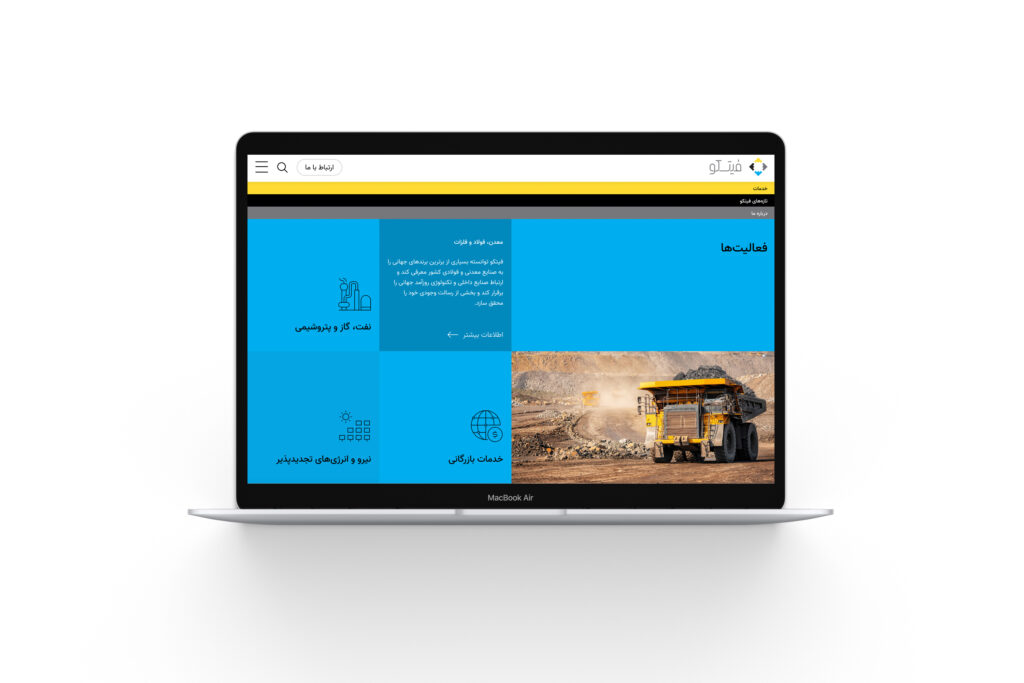
FITCO has contributed to developing and growing the country’s industries over the past two decades by offering engineering solutions, equipment supply, sourcing, procurement engineering, engineering consulting, technical support, and spare parts supply, relying on global knowledge and experience. The company has established itself as a trusted business partner, playing a key role in advancing the country’s infrastructure industries. The company’s areas of activity include mining and steel, supplying oil, gas, petrochemical equipment, and clean and renewable energy.
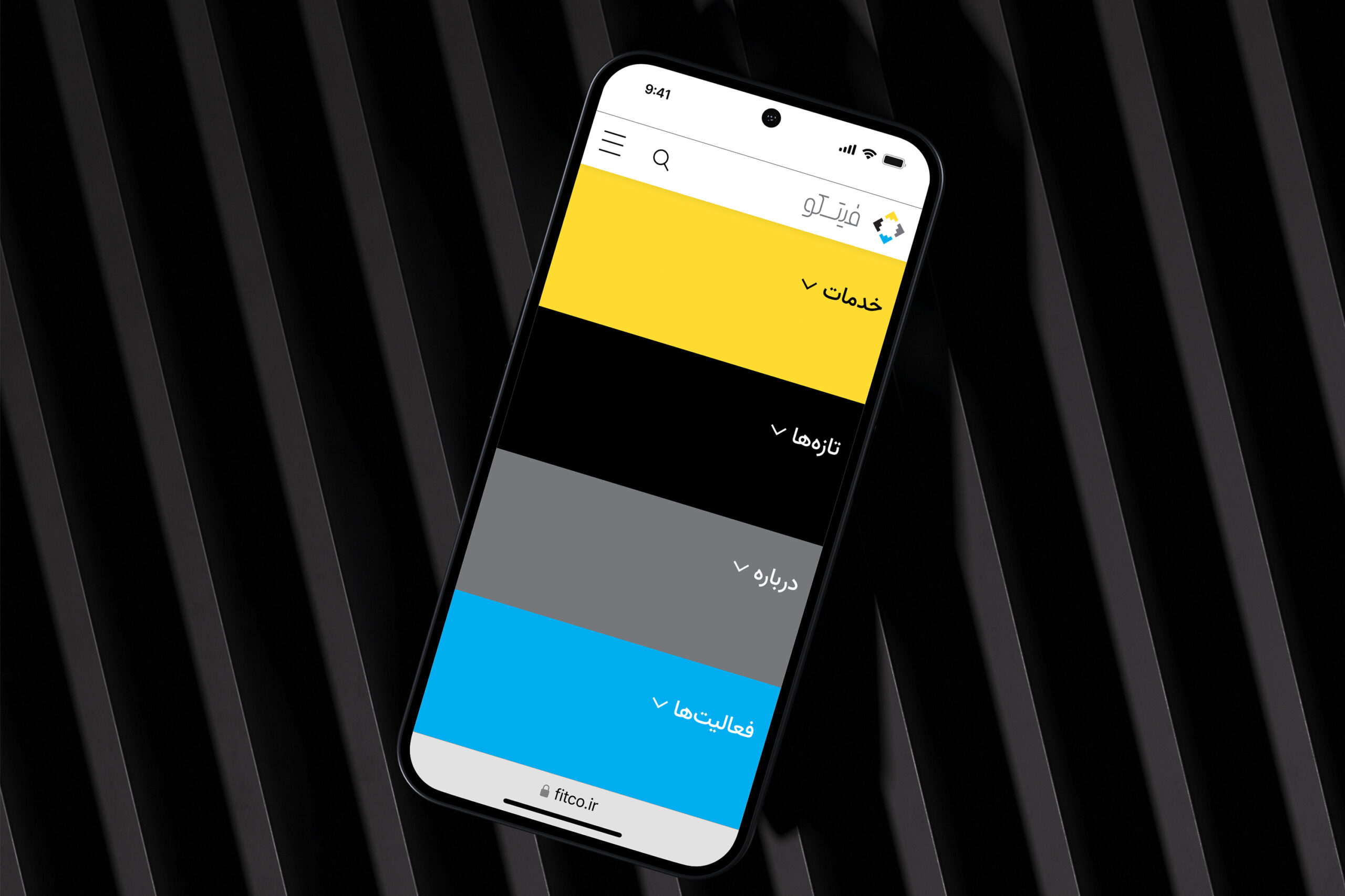
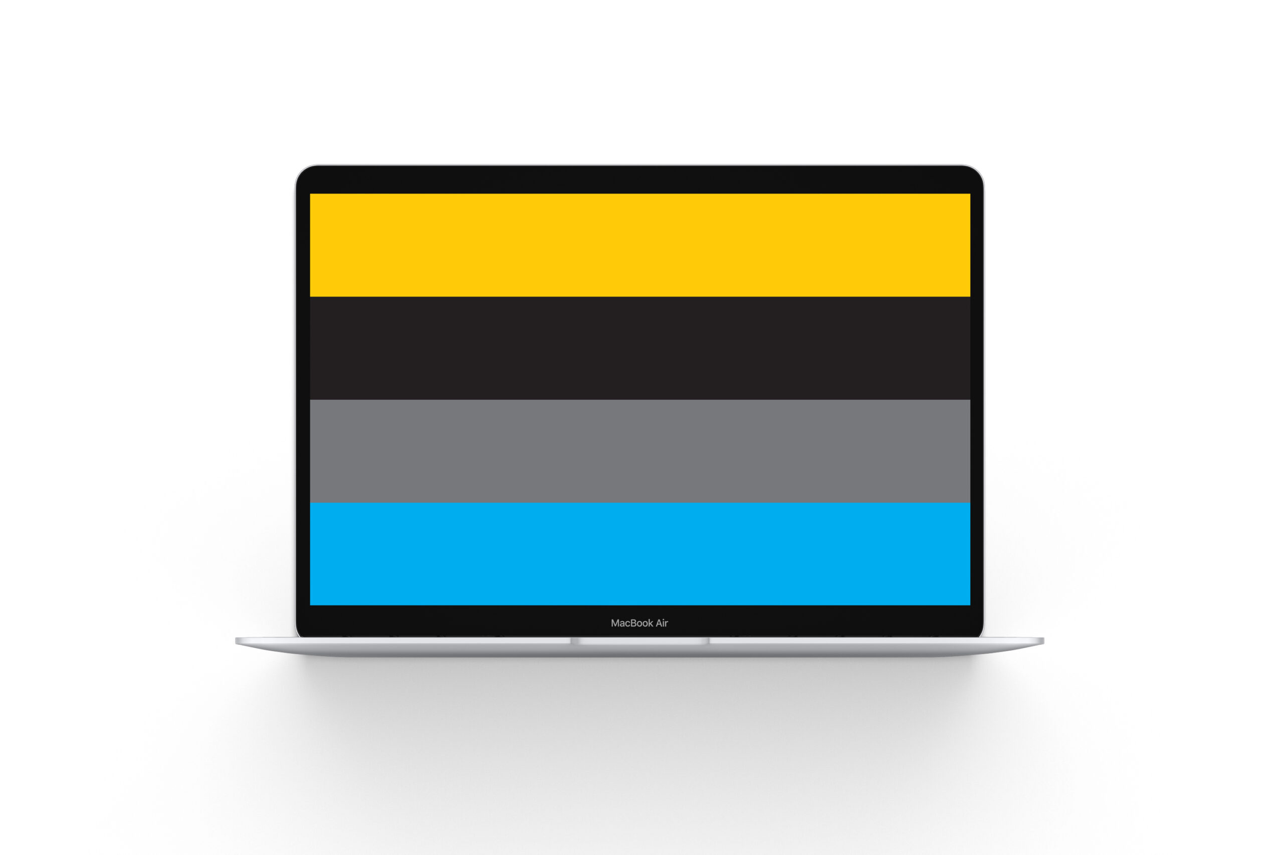
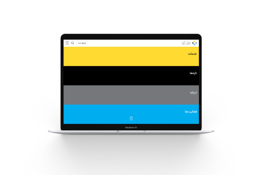
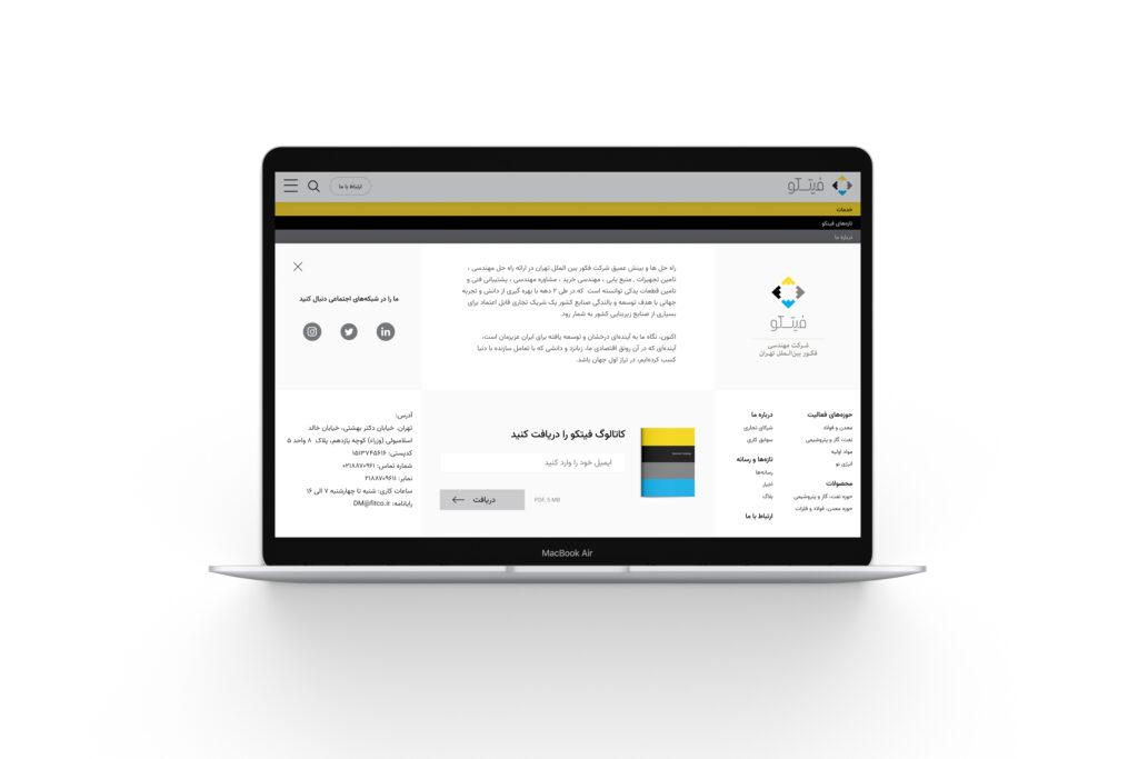
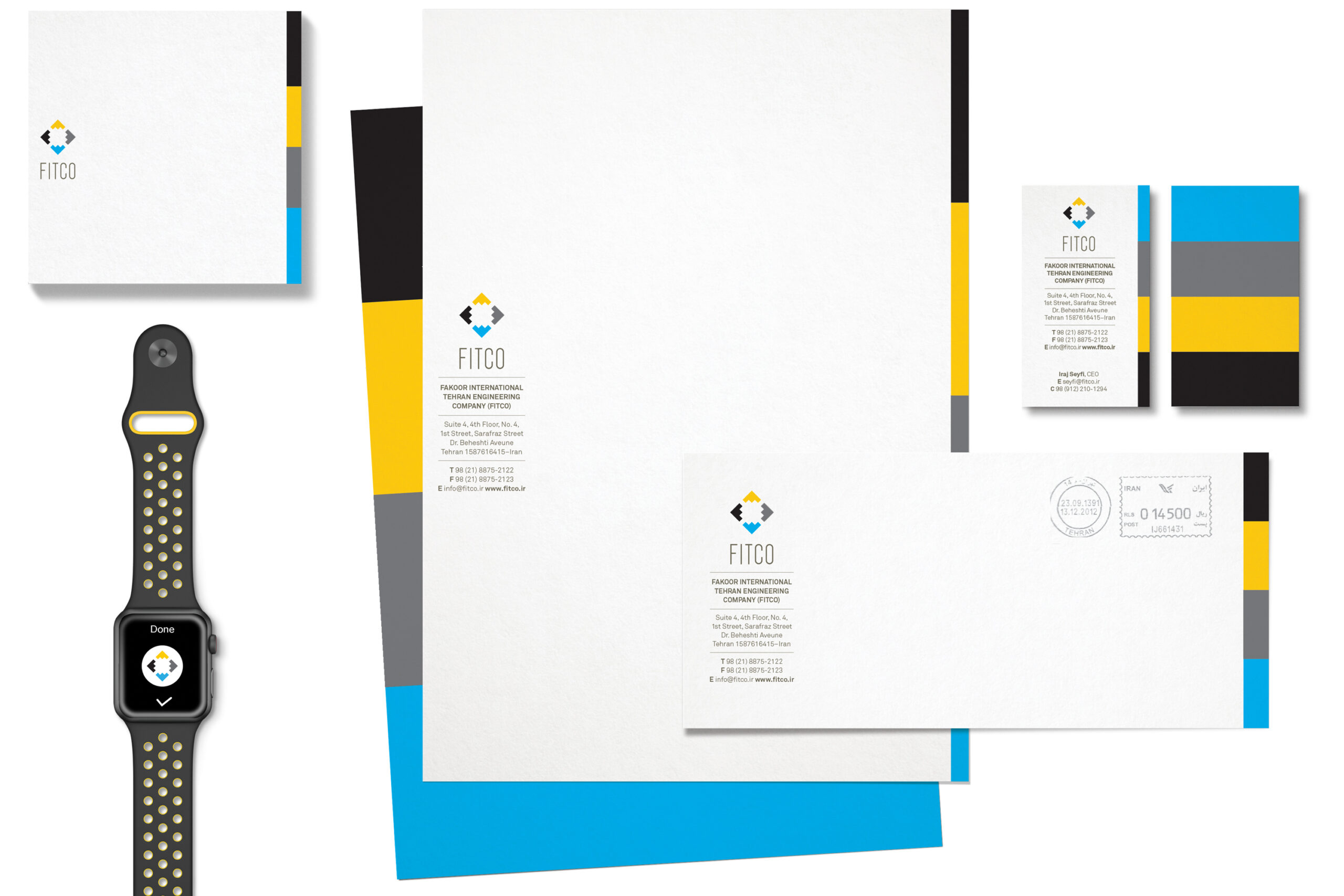
FITCO’s new visual identity is built around a simple yet meaningful symbol, created by repeating the simplified form of the letter “F” four times. Each of the four primary colors — black, yellow, blue, and gray — represents one of the company’s key areas of operation: mining and steel, oil and gas equipment supply, petrochemicals, and clean and renewable energy. These colors play an active role across all brand communication materials, ensuring consistency even in the absence of the symbol. FITCO’s website also leverages these four colors, creating a distinctive user experience that reflects the brand’s cohesive identity.
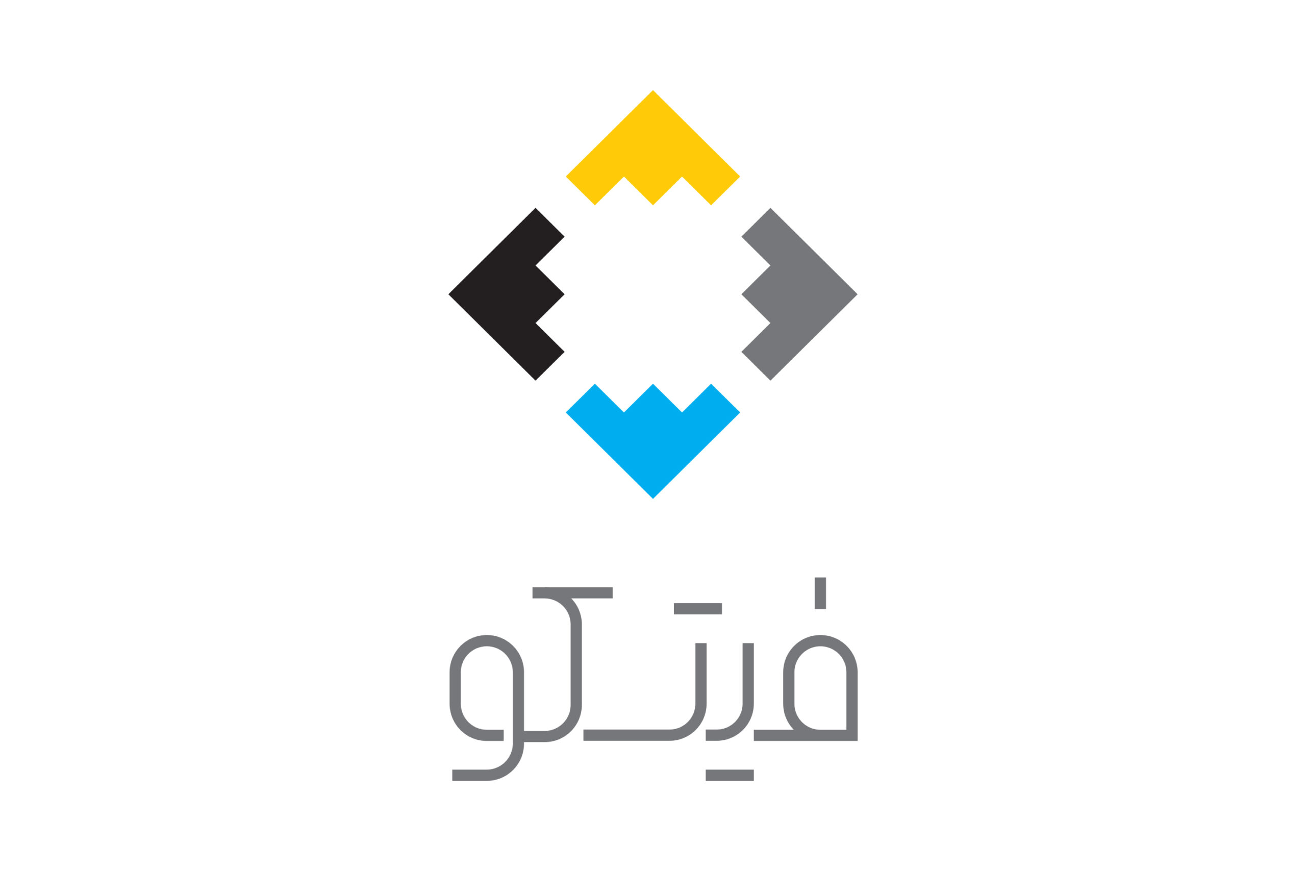
Black, yellow, blue, and gray represent one of the company’s key areas of operation: mining and steel, oil and gas equipment supply, petrochemicals, and clean and renewable energy.