Mehr began its activities with the opening of a bookstore in the western part of Tehran, focusing on literature, poetry, art, culture, and music. This initiative reflects the publisher’s commitment to fostering a vibrant cultural space, providing a platform for creative expression and intellectual engagement within the community.
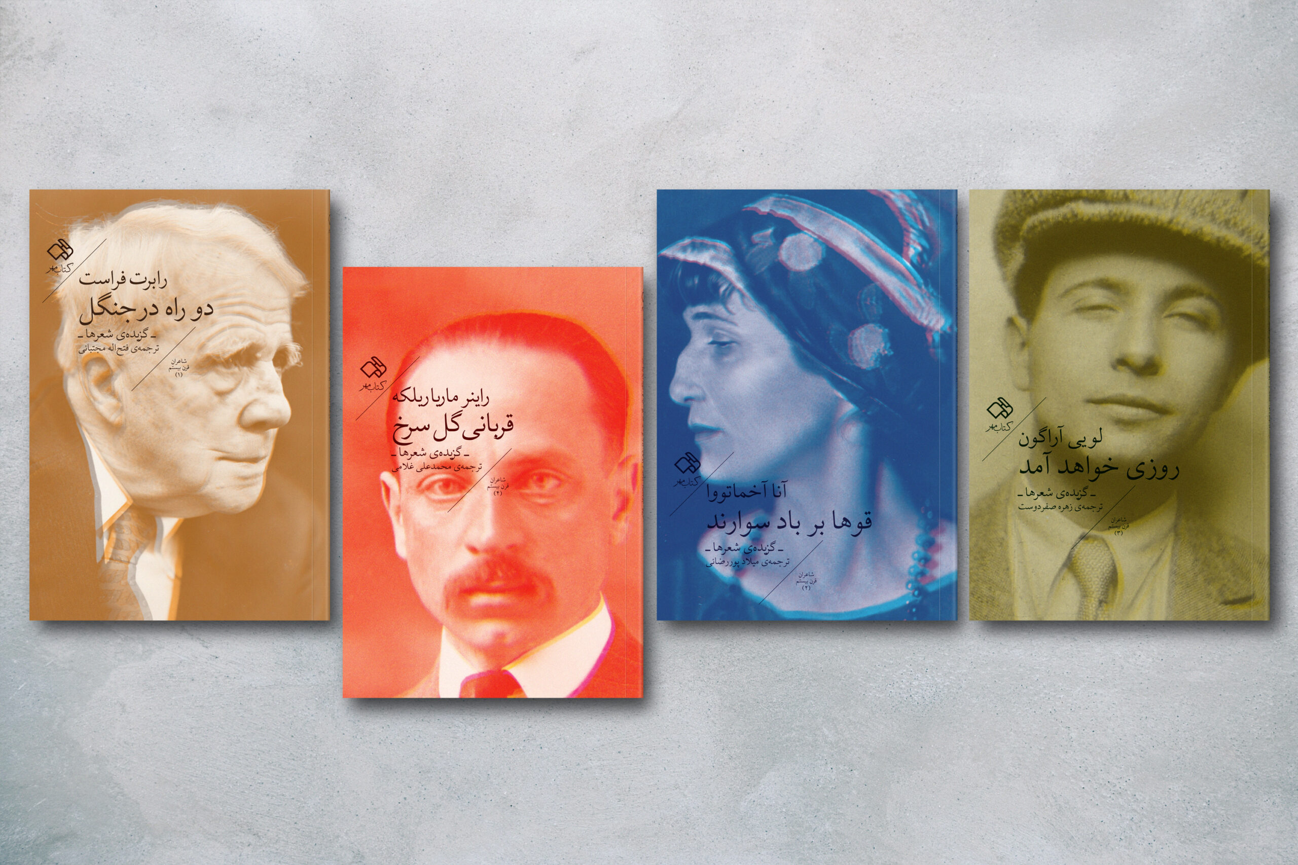
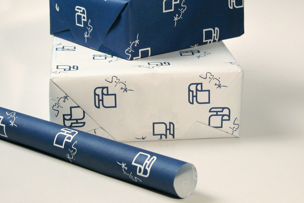
The Strong Farsi logo is inspired by the publisher’s name and the shape of a book, reflecting the essence of its identity. It visually represents the discovery of book-related forms at the core of the publisher’s mark. The logo design depicts a book being flipped through while simultaneously incorporating a three-dimensional form of the word “Mehr.” This thoughtful design approach ensures consistency across the publisher’s book cover series, creating a cohesive and recognizable visual identity.
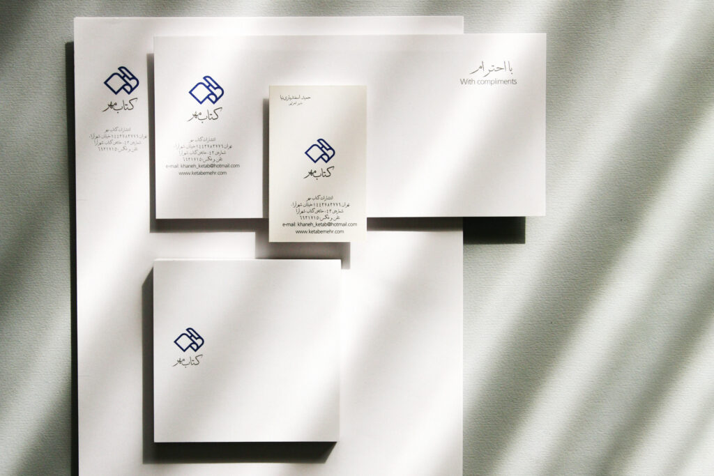

The logo design depicts a book being flipped through while simultaneously incorporating a three-dimensional form of the word ‘Mehr’.