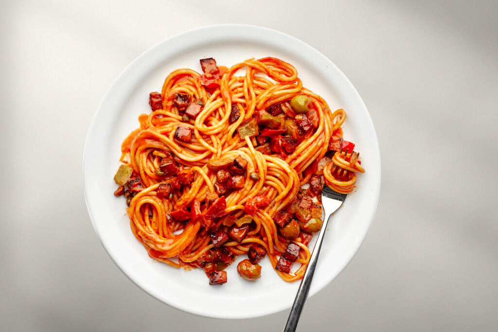
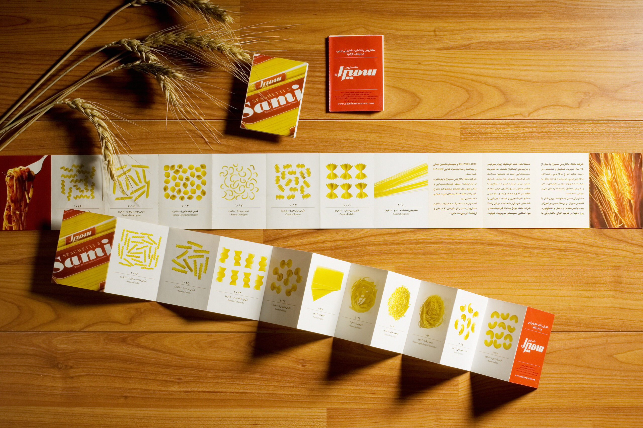
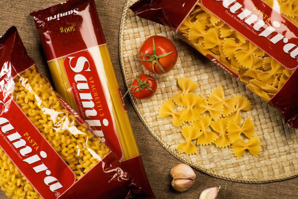
Pasta and spaghetti are some of the most affordable, quick, and popular foods worldwide, easily made with various sauces and ingredients. This simple and delicious dish holds a special place in many cultures due to its reasonable price and easy preparation, making it a staple in every household. Manta Company, with its Samira brand of pasta, began production nearly five decades ago and quickly gained a significant share of the pasta market. Its product range includes various types of pasta, such as spaghetti, fettuccine, lasagna, vermicelli, and ash noodles.
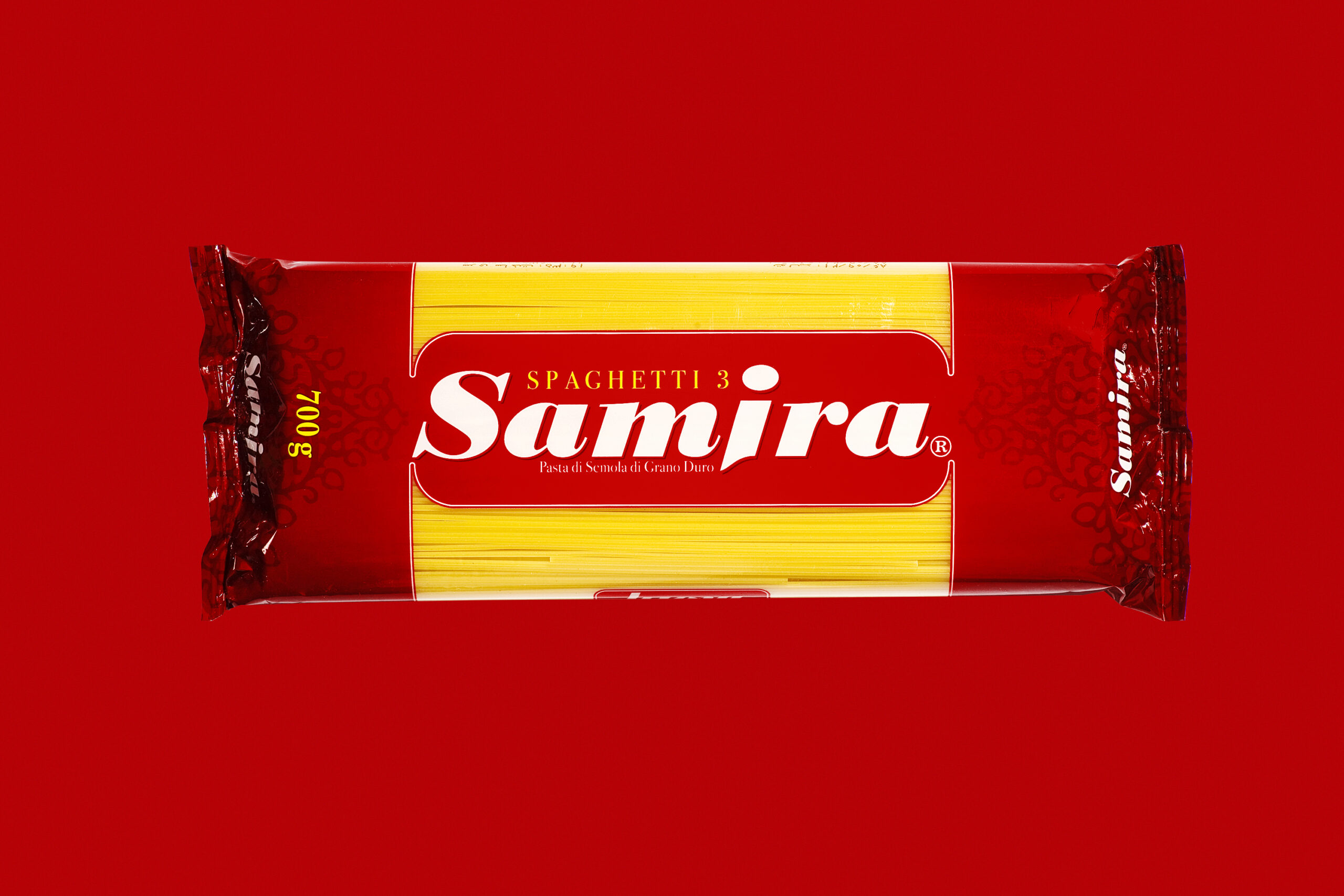
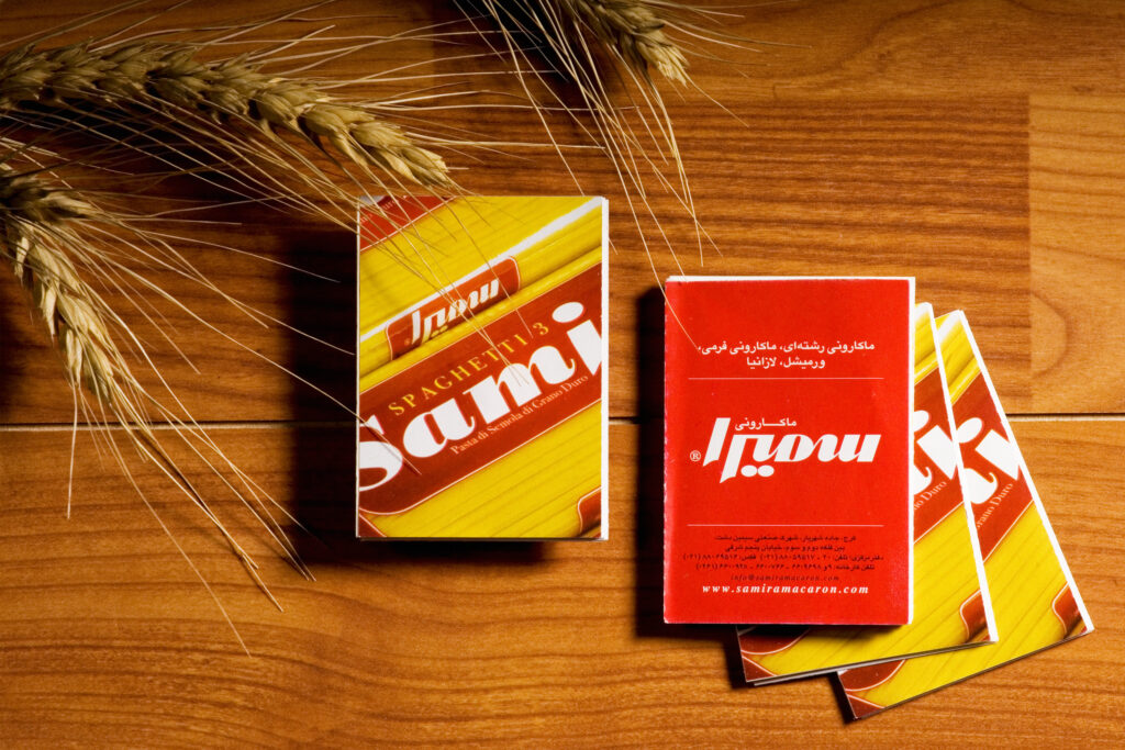
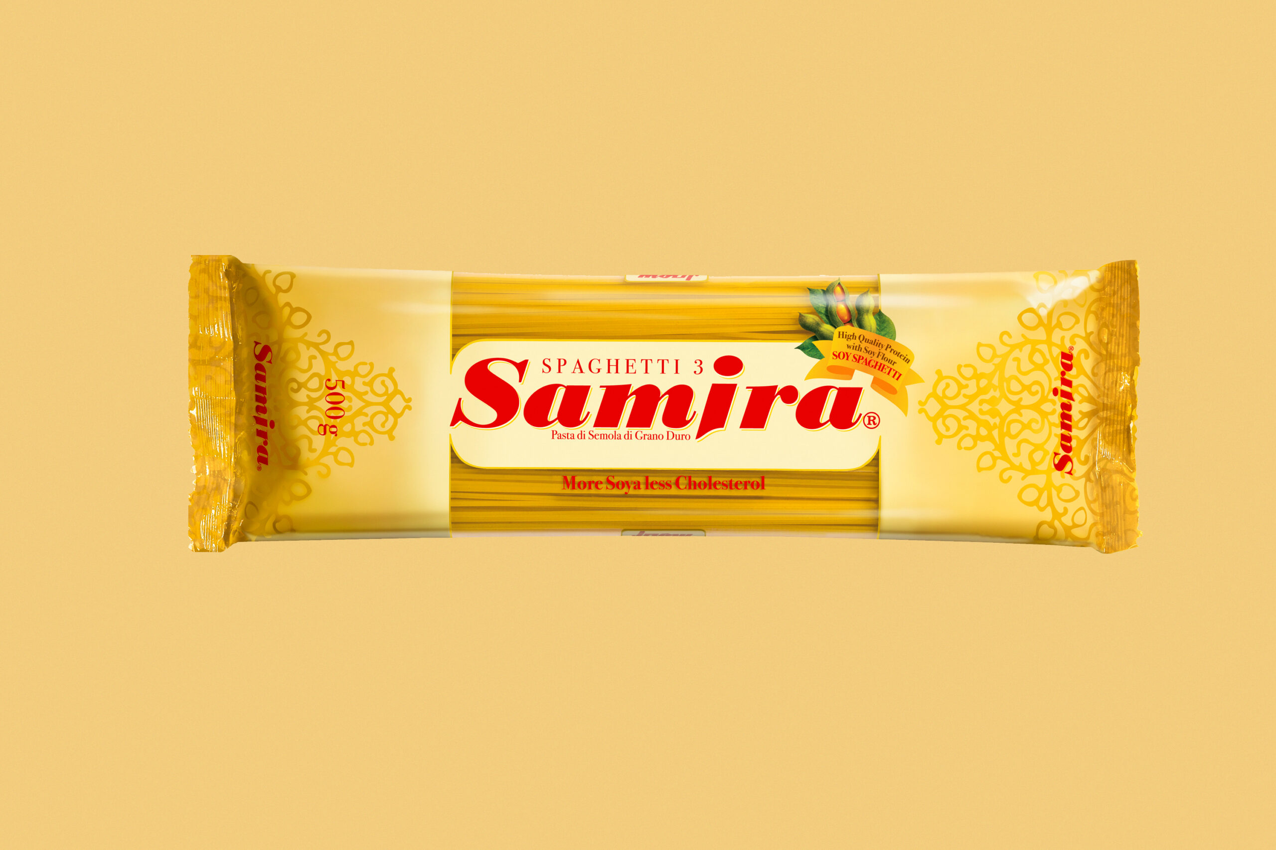
The brand design concept is based on a bold bilingual logotype with a tall and slender structure that emphasizes elegance and verticality. In the packaging design, the transparent strip not only conveys a sense of trust and transparency by revealing the pasta strands but also enhances visual appeal by showcasing the variety of pasta shapes.
This clear window, combined with a minimalist color palette, evokes a premium and refined feel, creating a visual experience that is simple yet impactful. The overall packaging design effectively reflects Samira’s brand identity and values. Additionally, the use of red—paired with the natural yellow tone of the pasta—creates a lively, harmonious color combination that helps the brand stand out on store shelves.

The transparent strip not only conveys a sense of trust and transparency by revealing the pasta strands but also enhances visual appeal by showcasing the variety of pasta shapes.