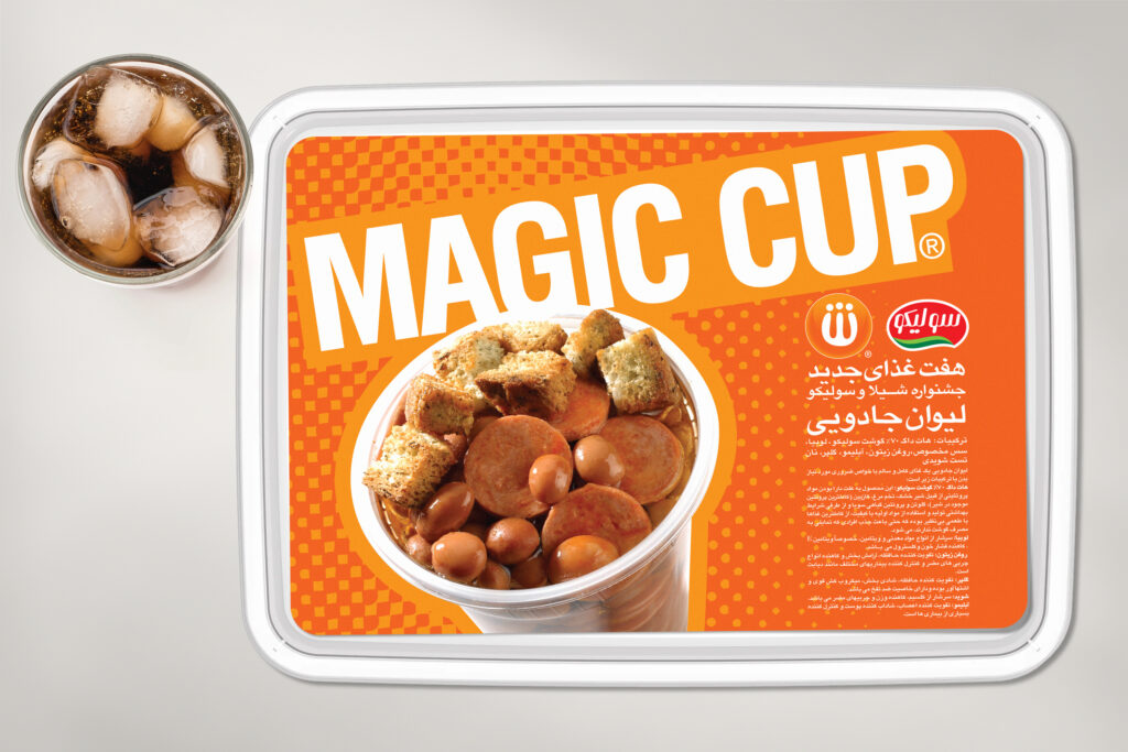
More than two decades ago, Shila Chain Restaurants began its journey by opening its first branch in Tehran and offering sausage sandwiches. Today, with a diverse menu that includes pizza, hamburgers, cheeseburgers, and other fast food items, the brand operates over 60 branches nationwide. By utilizing an integrated system encompassing raw material production in its factory, systematic distribution, and centralized branch management, Shila has established itself as one of Iran’s largest fast food chains.
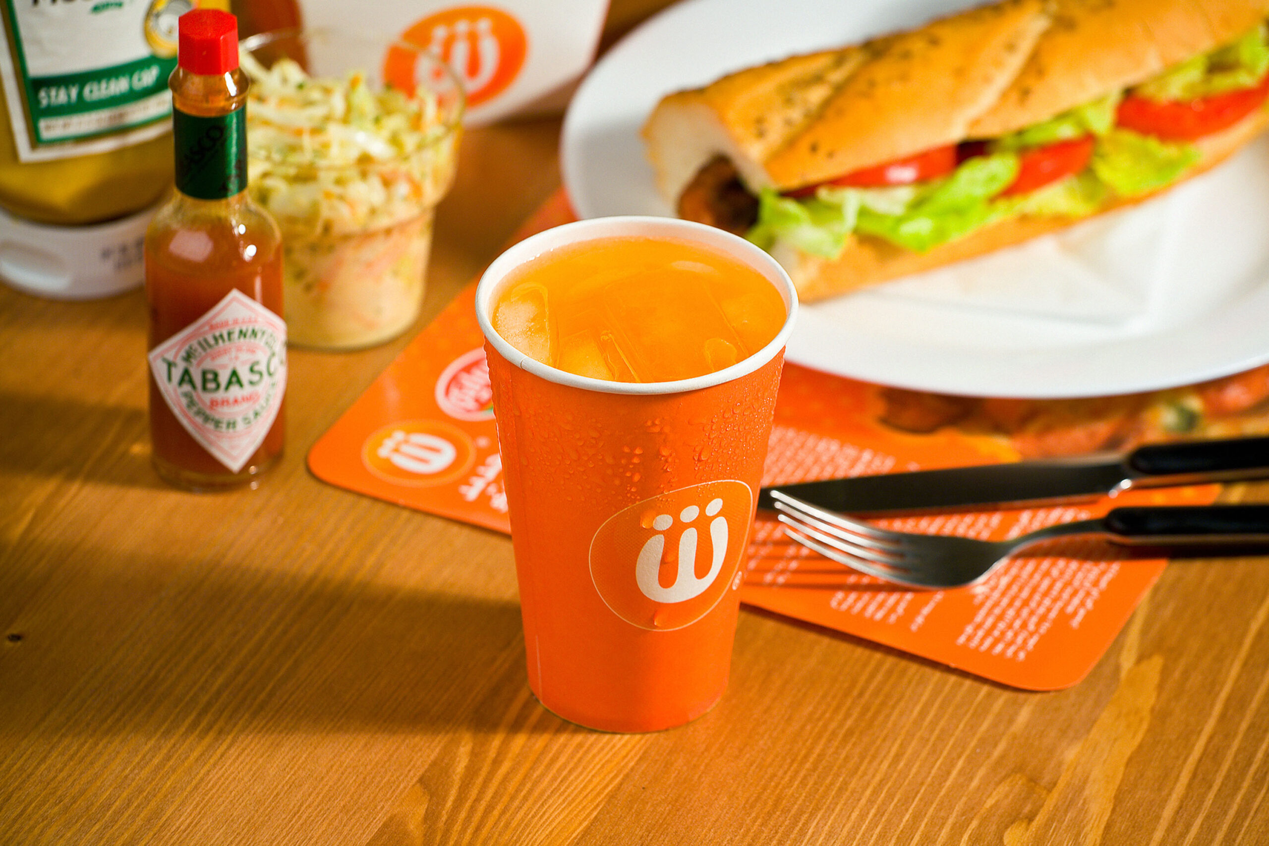
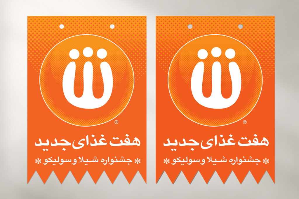
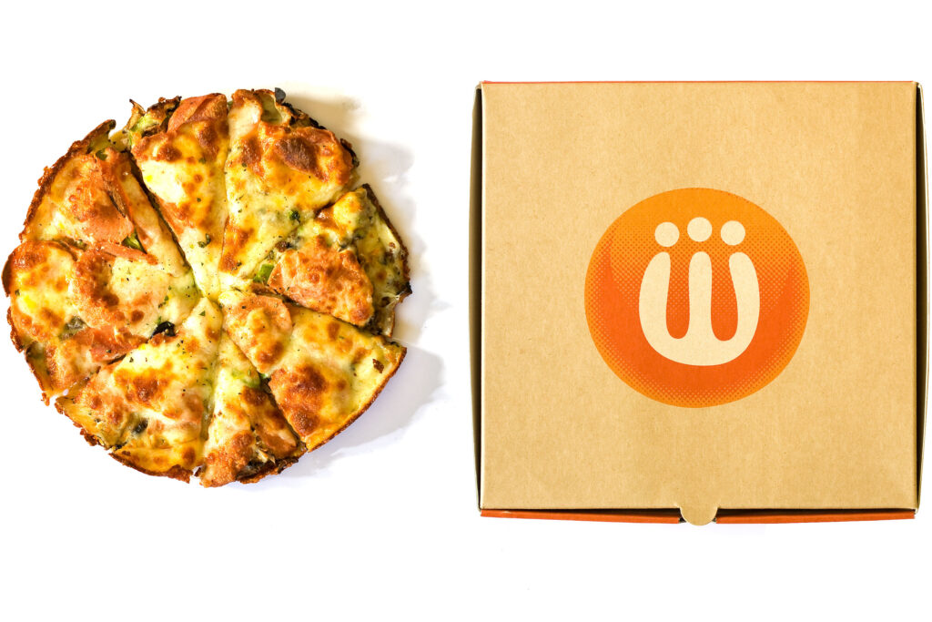
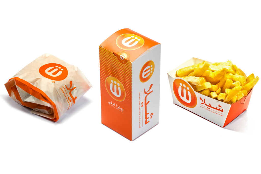
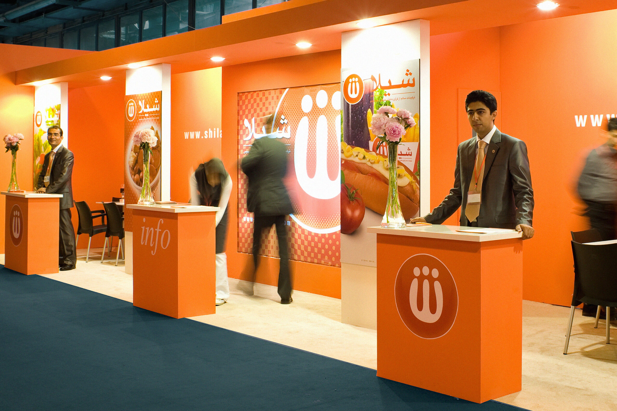
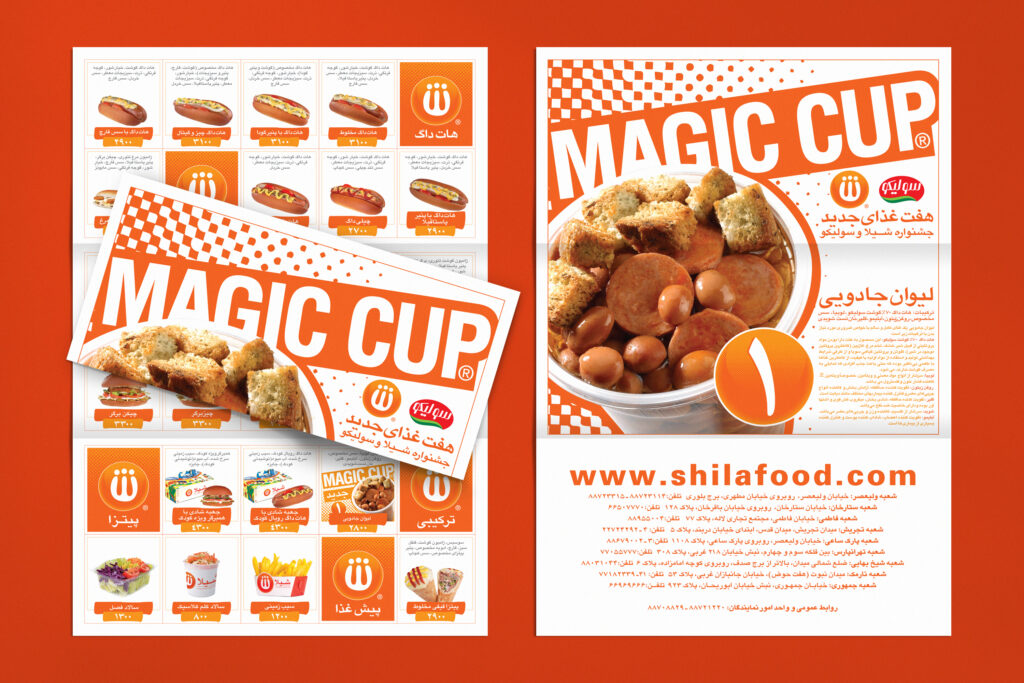
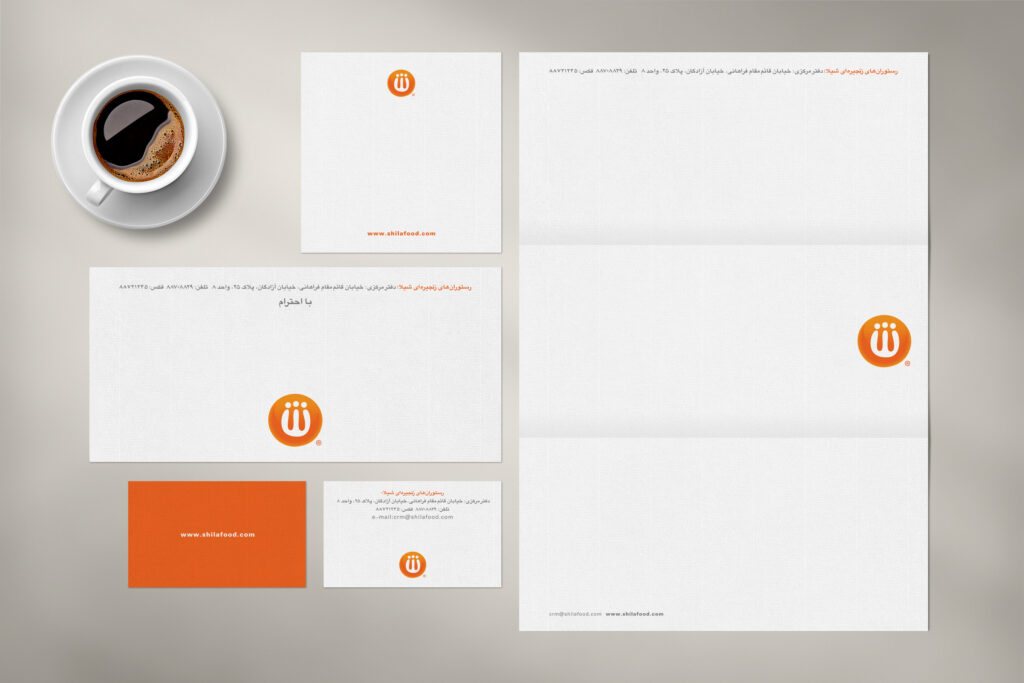
Shila’s visual identity is defined by its vibrant orange color, which is both appetizing and attention-grabbing, evoking energy and freshness. The freeform Persian typography transforms the letter “Sh” into a symbol of creativity and dynamism. This “Sh,” with its three dots, represents three heads, symbolizing family and emphasizing the collective, warm experience of dining together. The surrounding circle is intentionally incomplete, referencing pizza dough before baking, conveying a sense of authenticity, craftsmanship, and natural quality. These elements together create a distinct and recognizable identity for Shila, fostering a strong visual and emotional connection with its audience.

“…appetizing and attention-grabbing, evoking energy and freshness”.